Short Form Feed
Avg My List Adds (Phase 1)
+16%
Avg My List Adds (Phase 2)
+32%
THE OPPORTUNITY
Paramount+ had no short form engagement layer and no established pattern for how it could work across platforms. I was selected to lead design on an incubator initiative with the VP of Product Innovation and Pluto TV team to define that vision, exploring how short form video could drive daily habits, expand discovery, and create new pathways into long form content.
The Challenge
Designing a designated short form video space in Paramount+ with enough visibility to spark curiosity, while balancing its presence in the discovery experience to complement long form content, rather than cannibalize it. Reaching an MVP without portrait video assets required close partnership with engineering to validate feasible approaches across iOS, Android, and Roku constraints.
My ROLE
Lead Product Designer
Scope & Ownership
UI, User Flows, IxD, Prototypes, Competitive Analysis, Experimentation Strategy, Research Partnership, Handoff
THE Team
VP of Product Innovation, Product Manager, Pluto TV Product Designer, User Research, 10+ Engineers/QA
Platforms
iOS, Android Mobile, tvOS, Roku
The Problem
Defining pain points
Business problems
- No high-frequency surface to drive incremental sessions between major content releases.
- Perception of Paramount+ as a destination app to watch specific long form content, rather than a place to go to discover something new.
- Sampling scenes from IP, rather than trailers, has proven to be an effective driver of engagement, but current video preview functionality is tied to logic that limits the opportunity to capitalize on this.
User problems
- Access to scenes of TV shows and movies is currently buried behind multiple taps/clicks on detail and collection pages.
- Preview discovery features on TV platforms rely on trailer videos to give users a taste, setting a tone that's more promotional than personalized.
- Video previews are completely absent from the mobile discovery experience, forcing users to consider what platform is best suited for their task ahead of time.
Previous short form video flow
Pluto TV Collaboration
What user research revealed
TV: High signal, low visibility
- Clips outperformed both metadata and trailers as a decision signal, with short scenes more quickly communicating tone and quality, without plot-forwarding bias.
- Across three entry points, the in-line carousel came closest to setting clear expectations, while the global nav item and "Press and Hold" tooltip were often missed or misread.
- Most users treated the experience like a rapid-fire filtering tool, skimming clips quickly and rarely watching them in full, indicating the value of the feature is likely contingent on a thoughtful approach to the personalization of its content and entry signal.
Mobile: Where familiarity met friction
Nav item: vertical vs. horizontal scroll
Long press: vertical vs. horizontal scroll
- Mobile users engaged longer per clip than on TV, but the majority of users missed the Press and Hold tooltip entirely.
- Users who associated the app with social media expected a vertical scroll experience, while those who associated the app with streaming expected a horizontal scroll experience.
- Users quickly disengaged when the feed felt off-genre or random, indicating curation quality and strong personalization are a must-have.
Paramount+ Concepts
Early validation & platform exploration
tvOS A/B test: Contextual entry
- What we tested: Used press-and-hold as a minimal-scope entry point to run the lowest-effort viable test of an immersive video-first experience on TV, keeping implementation complexity low to prioritize validating the core experience before optimizing for discoverability.
- What we learned: A second variant drove 32x higher Peek View engagement, isolating entry point accessibility as the primary adoption barrier. Users who reached Peek View drove a statistically significant +15.62% lift in My List adds per profile, a meaningful early signal given My List engagement has shown outsized impact on future video consumption.
- What we changed course on: The second variant was ultimately rolled back due to long-term UX concerns, framing the next phase around a more intentional, visible entry surface rather than a passive trigger.
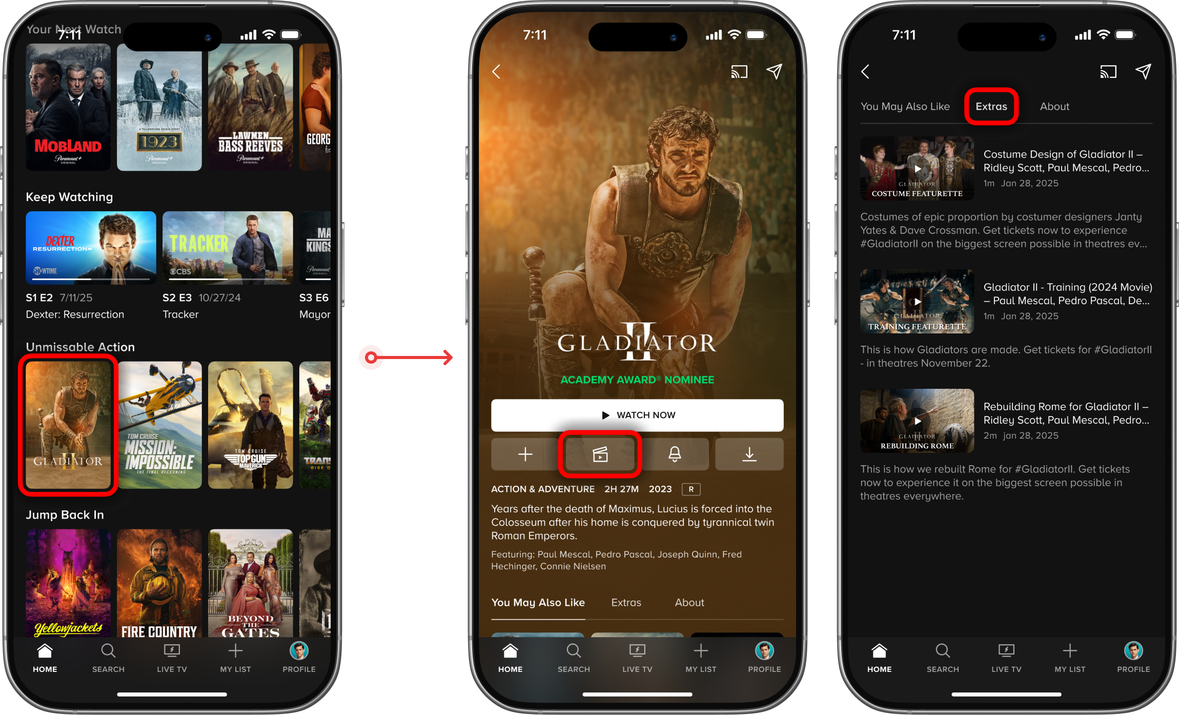
User testing: Detail page with discovery mechanics

- What we explored: Partnered with user research to lead cross-platform exploration of integrating preview-driven discovery into the content detail page on mobile and TV, enabling title browsing without losing context.
- What we learned: Research revealed that users arrive at the detail page ready to evaluate or commit to a specific title, not to browse. Putting a cross-title discovery mechanic inside a page built for that purpose created competing priorities that the design struggled to reconcile at this stage of exploration.
- What we changed course on: User testing surfaced enough friction around the intent mismatch that the concept didn't clear the bar to move forward, and with a recent detail page redesign already in market, the exploration was scoped out as a separate workstream in favor of a purpose-built discovery entry point.
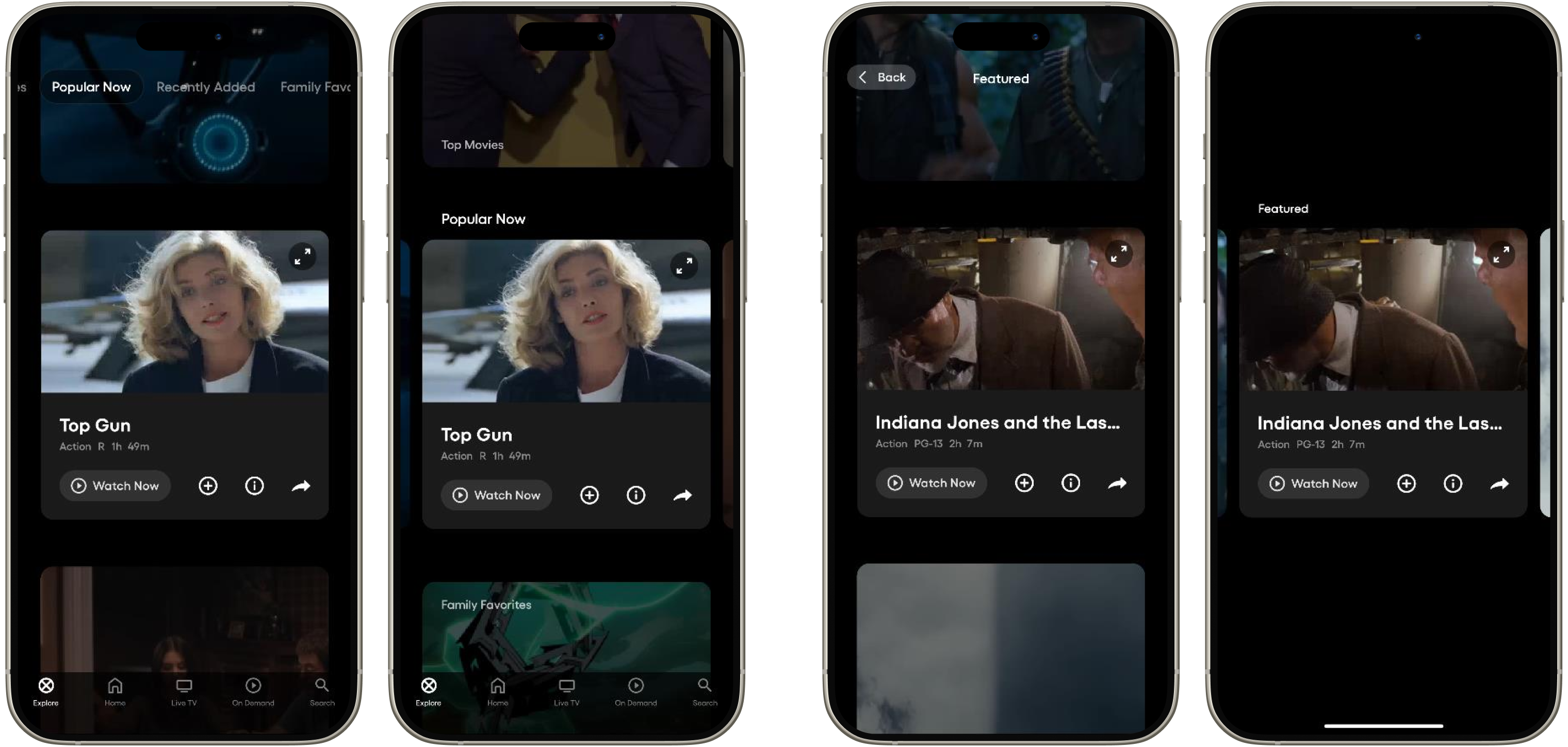
Mobile: Exploring entry points
.png)
- What we explored: Explored a range of entry point models for mobile including thematic category tiles and personalized recommendation rows, each offering different tradeoffs between contextual relevance and surface area within the existing discovery experience.
- What we learned: Early explorations surfaced a key tension between anchoring the experience within familiar browse patterns versus giving it enough separation to be perceived as a distinct, intentional feature rather than a reformatted carousel.
- What we changed course on: That tension reframed the entry point problem around legibility and intent-setting, shifting the direction toward a dedicated surface that signals a mode change rather than blending into the existing homepage structure, keeping short form additive to long form discovery rather than competing with it.
TECHNICAL Challenges
Portrait video on mobile
Building the video mirror effect
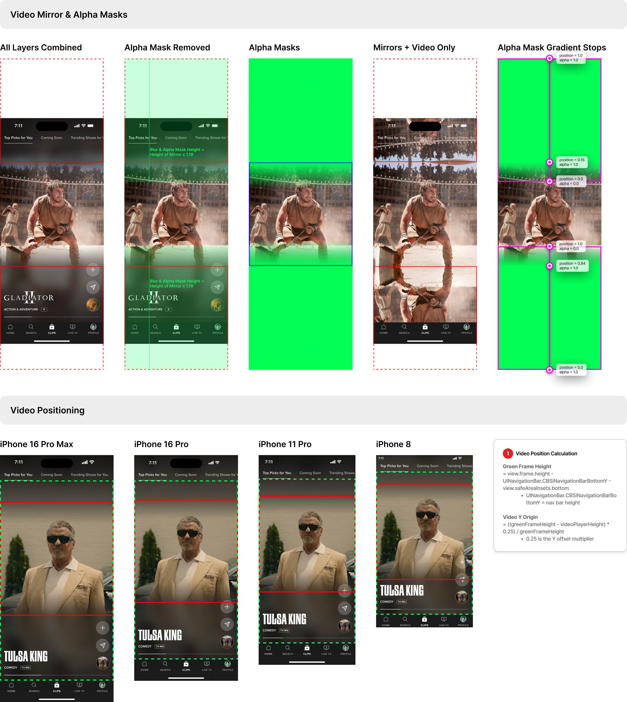
- The mirror background effect was the hardest part to translate into code because it needed to look like true full-bleed portrait video, while actually being a live composite of a mirrored reflection, blur, and gradient alpha mask that fades cleanly at the seam.
- We explored heavier render paths (including a Metal-based approach and ideas like pulling frames via AVFoundation and blurring downsampled buffers), but ultimately landed on a UIKit-native solution using UIBlurEffect for the reflection layer to keep playback smooth and battery-friendly while reusing the existing video stream instead of effectively rendering it twice.
WHERE WE LANDED
Picking a direction
iOS A/B test: A dedicated discovery destination
- What we tested: Evaluated the highest-visibility entry point available on mobile by promoting Clips in the main navigation on iOS, trading My List's nav position for a dedicated Clips destination.
- What we discovered: Entry rate was identified as the primary adoption barrier with only 3.4% of variant users tapping into Clips, but those who did returned for a second visit, signaling that the short form experience held up once users found it.
- What it unlocked: The low entry rate pointed to a distribution problem, shifting the next phase toward surfacing short form within destinations users already visit rather than asking them to seek out a new behavior, keeping short form contextually adjacent to long form intent rather than as an alternative to it, directly addressing the cannibalization risk the nav test surfaced.
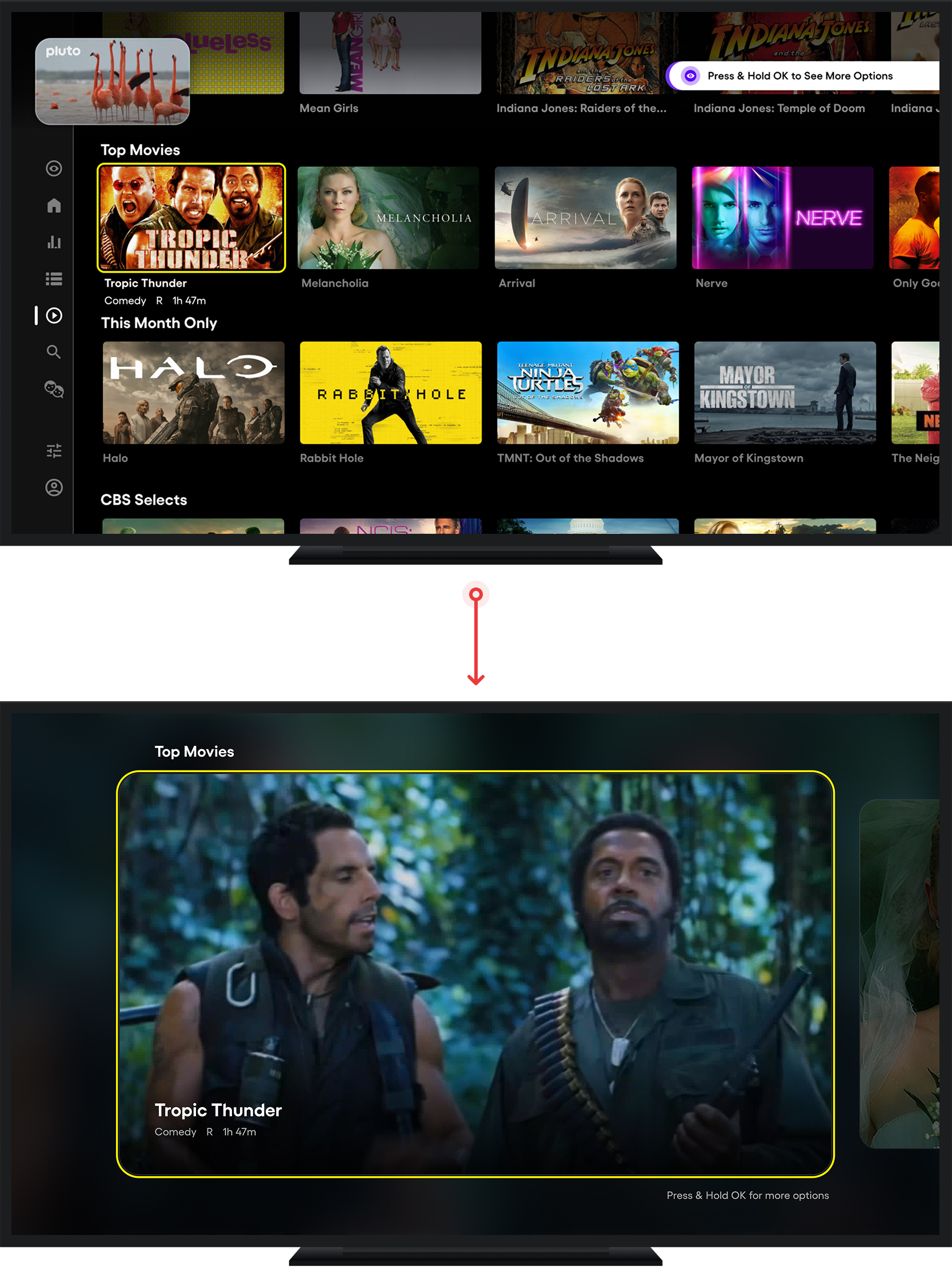
Roku A/B test: Refining the entry point
- What we tested: A 3-variant A/B test on Roku comparing the existing press-and-hold tooltip against a more prominent press-and-hold tooltip and a standalone homepage discovery component, with and without vertical scrolling within the experience.
- What we discovered: The standalone component with vertical scroll won decisively, increasing peek view engagement by over 1,500% compared to the tooltip and driving a +32% lift in My List adds with negligible impact on long form video plays.
- What it unlocked: Validated that short form content complements long form viewing rather than cannibalizing it, clearing the path to scale the experience with confidence that increased short form visibility drives discovery without undermining the core product.
What's Next
Reducing mobile discovery friction

- Expand availability of scenes in the clip catalog and test engagement with these against existing trailer videos.
- Address the content availability gaps by expanding category coverage to include Sports and News.
- With entry rate as the primary adoption barrier for iOS, this pointed us toward exploring a homepage short form carousel as the lower-friction path to reach users within a destination they already browse.
.png)